Logo Trends 2017
- By admin
- 0 Comments
- Logo Design . Logos
About this time last year, I posted about logo trends for 2016. We are in for a treat because LogoLounge, the world’s largest logo search engine, which is a members only site, has published and shared its data on logo trends for 2017. This is Bill Gardner’s 15th LogoLounge Report.
Before I reveal this year’s logo trends I thought it would be interesting to recap the trends of 2016. Here they are—
LOGO TRENDS OF 2016
1. Simplicity is a key trend—but, not always a good one. While a logo should be elemental and iconic, too much simplicity strips away all character
2. Sans serif fonts are in, and serifs are out (making so many logos look the same….)
3. Geometric shapes, especially circles are popular
4. Symbols, including emojies are gaining influence in our world
5. Keywords with Increasing Usage– fitness, green, health, modern, clean, sans-serif, water, mountains, locator, pin, tea, non-profit, real estate, brewery, culture, museum, birds
6. Keywords with Decreasing Usage– vintage, law, sports, baking, entertainment, video games, technology, food, ministry
7. New Design Styles– Ombre, Circles, Half & Half, Linked, Stimming, Dog Eared, Corners, Line Dash, Off Shift, Curls, Pocket Shield, Slices, Letterblock, Benders, Bars
In contrast, here is a synopsis of logo trends for 2017—
Logo Trends of 2017 Summary
• Color Split
• Doubles
• Ellipses
• Fades
• Microlines
• Multicentric
• Pasta Bends
• Rising Color
• Shadow Breaks
• Simple Overlays
• Simplicity
• Text Boxes
• Wings
• Wrapped
• Yin Yang
And here they are!
Shadow Breaks
Always visually interesting (and thus engaging) is when designers create a line-break where one element briefly passes beneath another. That little bit of dimension just draws the eye in.
Fades
These marks are defined by a gradient. They look fresh against both white and black backgrounds and seem to connote a new beginning.
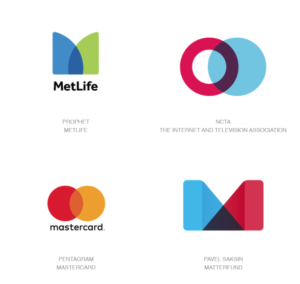
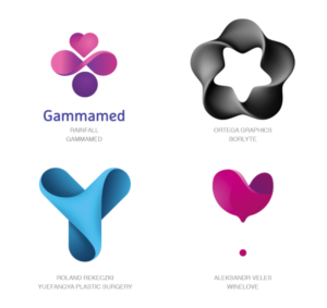
Rising Color
Similar to Shadow Breaks above, Rising Colors is a subtle approach that separates the layers of a logo and adds depth.
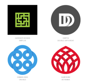
Simplicity
This is my favorite and I would bet the most enduring. Clean, unencumbered, classic shapes. In the examples below, the shapes are classic while the color usage is very current.
Simple Overlays
The clarity of simple transparency is always intriguing, amusing and a joy to behold. It is memorable and interesting— a big part of a logo’s purpose.
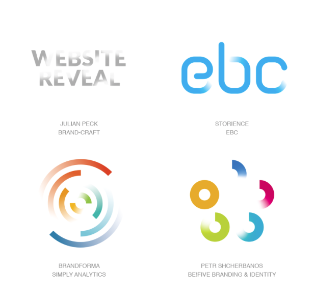
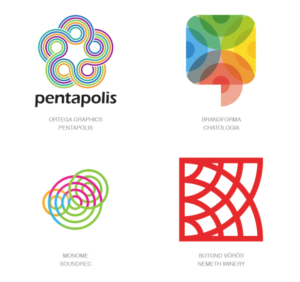
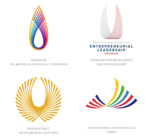
MultiCentric
Classic. Stately. Organic. Harkens the Olympics.
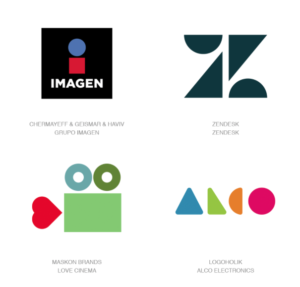
Ellipses
Derived from digital symbolism, this shape has entered into the public’s visual vocabulary.
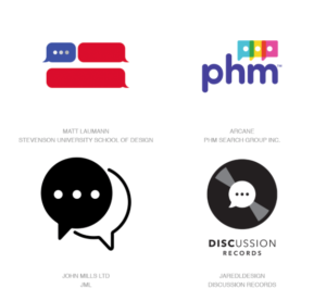
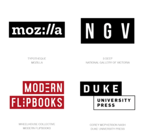
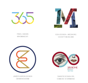
Text Boxes
As a typography fan, I do like typographic logos, especially when they are clever and/or alter letterforms to express a concept.
Pasta Bends
Derived from virtual reality. A bit too much of a visual reference to plastic for my taste.
Wrapped
Somewhat puzzle based and visually interesting, this technique should be used carefully and sparingly. It is easy for your logo to be overcome by the technique itself. If done well, it can have an “aha” effect. But I don’t predict this will be enduring.

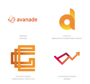
Doubles
Another new take on a classic look. When a designer can deconstruct something a bit and present it in a new way, it grabs your attention. That is, always the essential job of a logo.

Wings
Lines in general, are very popular in logo design. This trend promotes a light, contemporary and aspirational effect.
Color Split
Again another simple, unexpected and interesting visual. Used in the Google “G” it breaks up a simple letterform and can showcase a company’s corporate colors. I like this one.
How does your logo compare to these trends and conventions?
If you need a new logo or logo update, call SCG. We are the logo professionals!
914 273-9517 • info@spencercreativegroup.com
About the Author
Karen Spencer is a digital marketer and design evangelist who provides web design and graphic design solutions. Karen believes that good design isn’t pretty—good design solves a problem.
In today’s digital marketing environment, your web site has to work harder than ever to bring you leads and convert visitors to happy clients.
Spencer Creative Group is a Westchester County design firm, located in New Rochelle, New York. SCG specializes in design for the medical, financial industries as well as design for higher education and not-for-profits.