
The Curated List—12 Web Trends for 2016
- By admin
- 0 Comments
- Content . Flat Design . Marketing . Material Design . Mobile Web . User Experience . UX . Web Data . Web Design
Happy 2016!
Design trends change as the technology changes. The move to “mostly mobile” has been a huge driver in the way we design for the web. Our layouts must work on a 5″ screen. This has greatly influenced the way we design, resulting in cleaner, simplified layouts that work on the phone.
Here is a curated list of the top 12 web trends to look for in 2016.
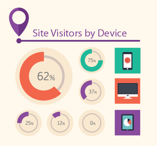
1. Mobile Rules—statistics show that 72% of consumers want mobile-friendly sites (Google Research). 2015 was the year of responsive design, and designers and developers must continue to design for screens that average 3.5″–5.5″—a small piece of design real estate!

Mobile Web Usage
2. Data is the Driver—design and content decisions will be data driven. With Google Analytics, A/B testing and the proliferation of web data analytic tools, organizations can measure and adjust their sites for better conversion more easily than ever. One well regarded service is Clicky Analytics, (clicky.com) which provides real-time analytics.
3. More Relevant Content—The relevance and value of content to consumer is finally understood. Practitioners from the publishing world of the previous century were trained to produce content that mattered. The wild-west era of churning out content that is not well written and of high value to the reader is coming to an end.
4. User Interface is the Priority—Patterns for UX have developed and consumers have come to expect familiar conventions when landing on a new site. The focus will be on user interaction when designing—as it always should be. “Form follows function” (quoted from Louis Sullivan) is the professional designer’s mantra. Steve Krug’s “don’t make me think” maxim has also been taken to heart. Companies are realizing that if it’s hard to do, people won’t do it. UX has matured and become a respected, integral part of the web planning process.
5. Less Visual Clutter—Clean, simple design will prevail. Users are grazing from site to site and want quick, easy-to-comprehend content without distraction. This may mean we will see fewer sliders and animation effects and better use of typographic hierarchy.
6. Google’s Material Design and Flat Design 2.0—these design movements integrate more shadow and depth into simplified graphics. This trend adds interest to images while keeping them simple enough to render effectively on mobile devices. You can learn more about Google’s Material Design here https://www.google.com/design/spec/material-design/introduction.html
7. Hero Images—people learn more visually than through any other sense. The use of a great image captures the viewers attention and draws them in to absorb the content. An image immediately gives the viewer a great deal of information about the persona of a company—is it contemporary, traditional, well organized, edgy?
8. Increased Use of Illustration—and less photography, allowing viewers to use their own imagination in interpreting the visual and better relate to the image. Stock photography featuring look-alike, grinning models may start to fade. (Let’s hope!)
9. Better Use of Typography—every designer knows the importance of typography in design. Used correctly typography creates a visual hierarchy and conveys mood and information. The availability of web fonts has opened the door to more varied use of typography online.

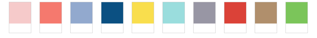
10. Bolder Use of Color—to date, designers have stuck to muted, web safe colors. A movement towards brighter use of color seems to be in progress. Pantone’s color predictions for Spring 2016 are shown below.
11. Card Layouts— influenced by Pinterest, these layouts feature squares and rectangles, each containing a complete snack-sized amount of content. Card layouts don’t focus on hierarchy. The user has complete control over which small bit of content he or she wants to engage with. In addition, card layouts fall into line easily on mobile devices.
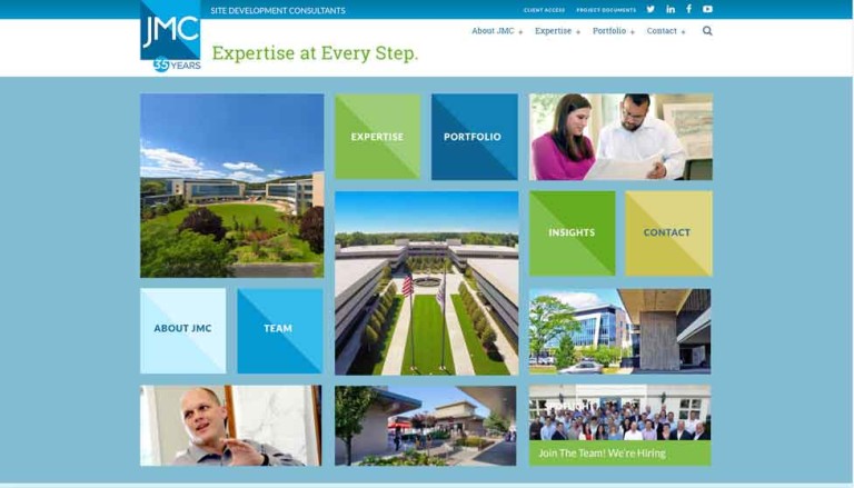
Web Site with Card Layout
12. The Long Scroll— responsive sites on mobile devices made the long scroll popular—a clean, one click way to view information. Your key information and navigation should still be kept above the fold, but visitors are accustomed to scrolling down today.
Is your site ready for 2016?
Call Spencer Creative group to get your site ready to do business in the new year!
Listen. Design. Code. Analyze.
914.273.9517
Click here for your free download of “The ROI of Good Design”
Sources—awwwards.com, quora.com, www.mediative.com, creativebloq.com, smart insights.com